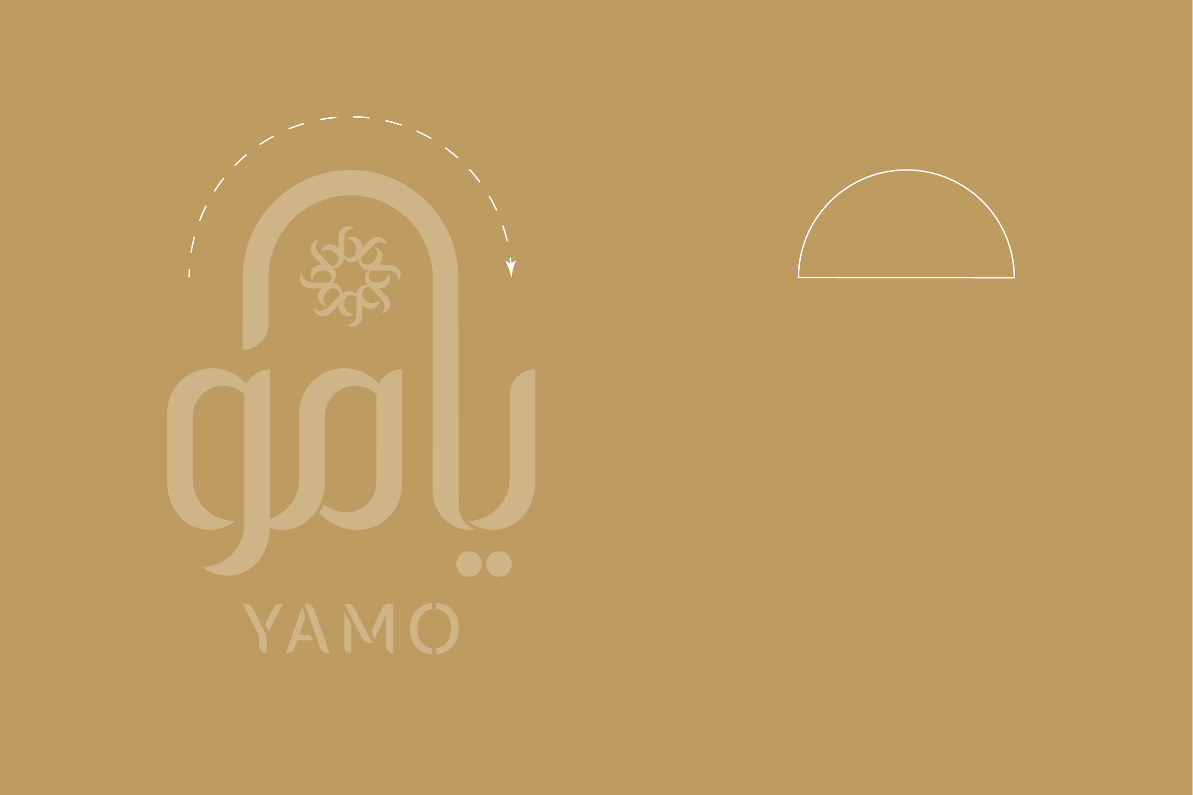
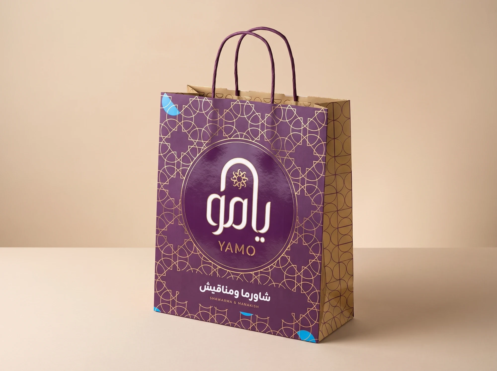
An identity for Yamo, يامو, a shawarma and manakish restaurant. The Arabic name is drawn so its first letter rises into an arch, and the arch and the half-moon cut from it run through everything the brand serves.
The logo
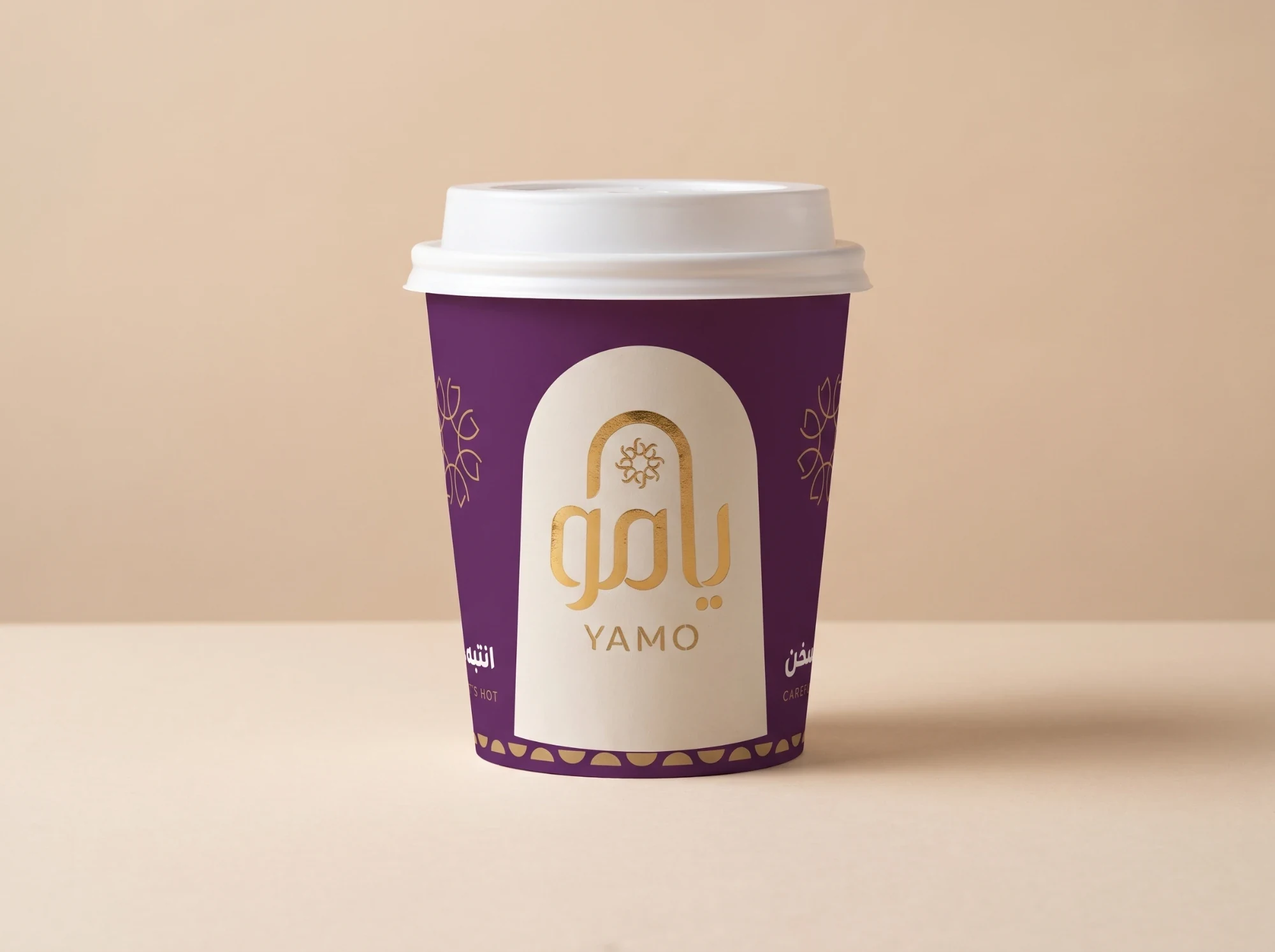
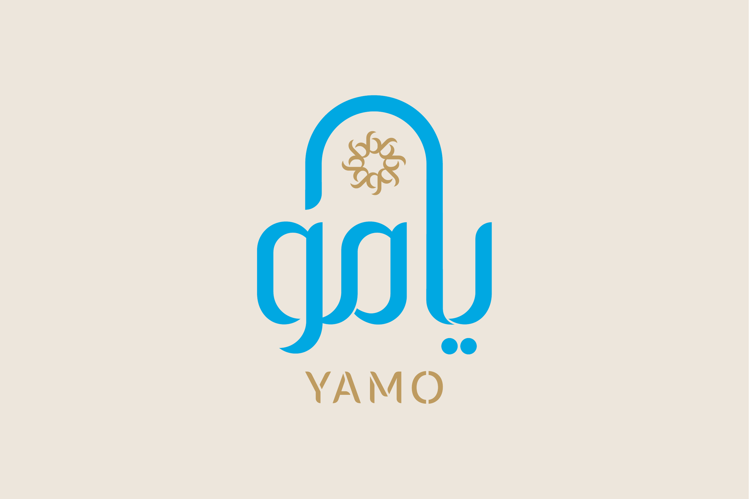
The arch rises from يامو and frames a gold rosette, with YAMO in gold below. On small surfaces the logo sits in a blue disc. Traced from the logo, the arch also gives the half-moon that the patterns are built from.

Colour and pattern
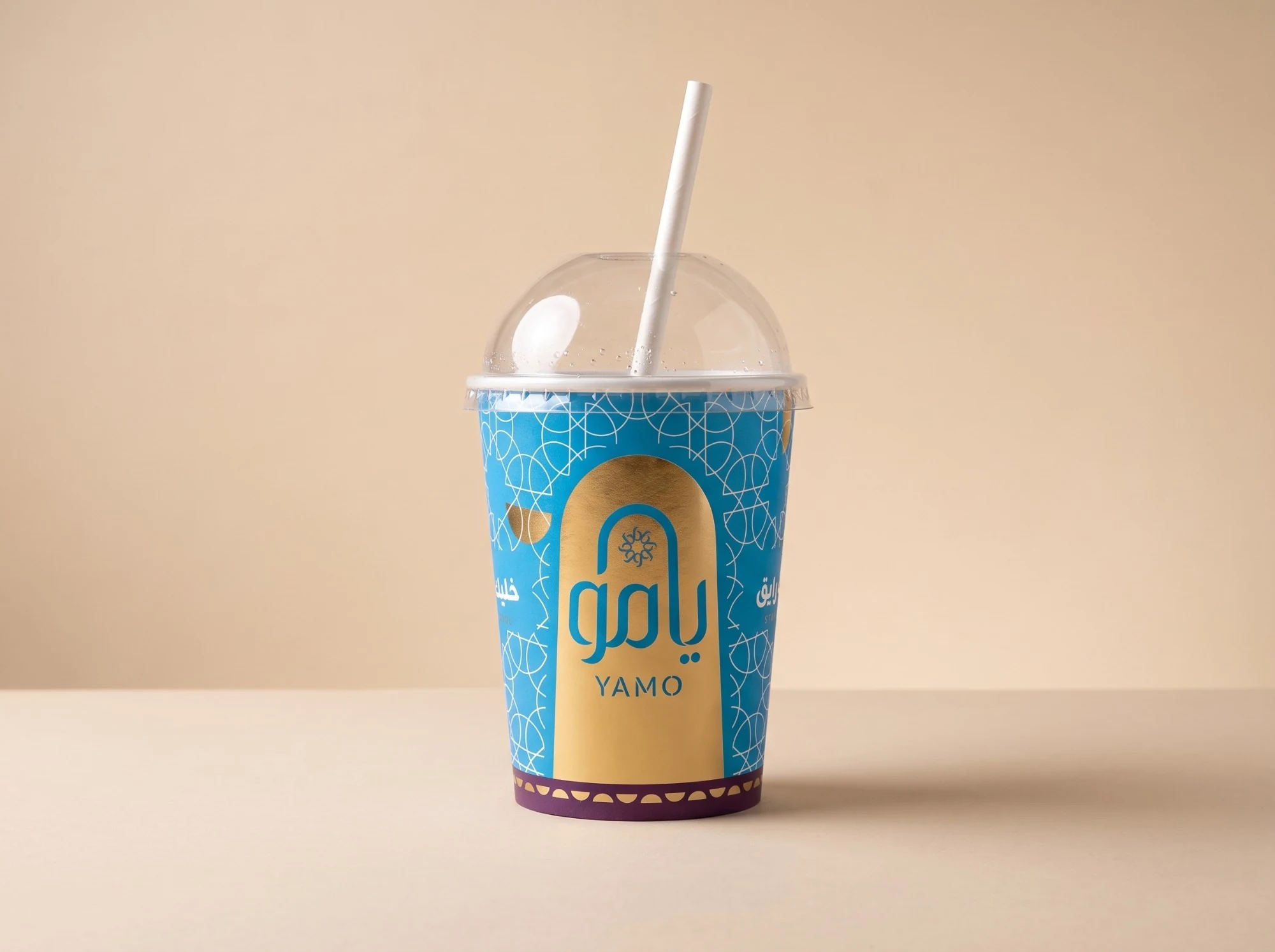
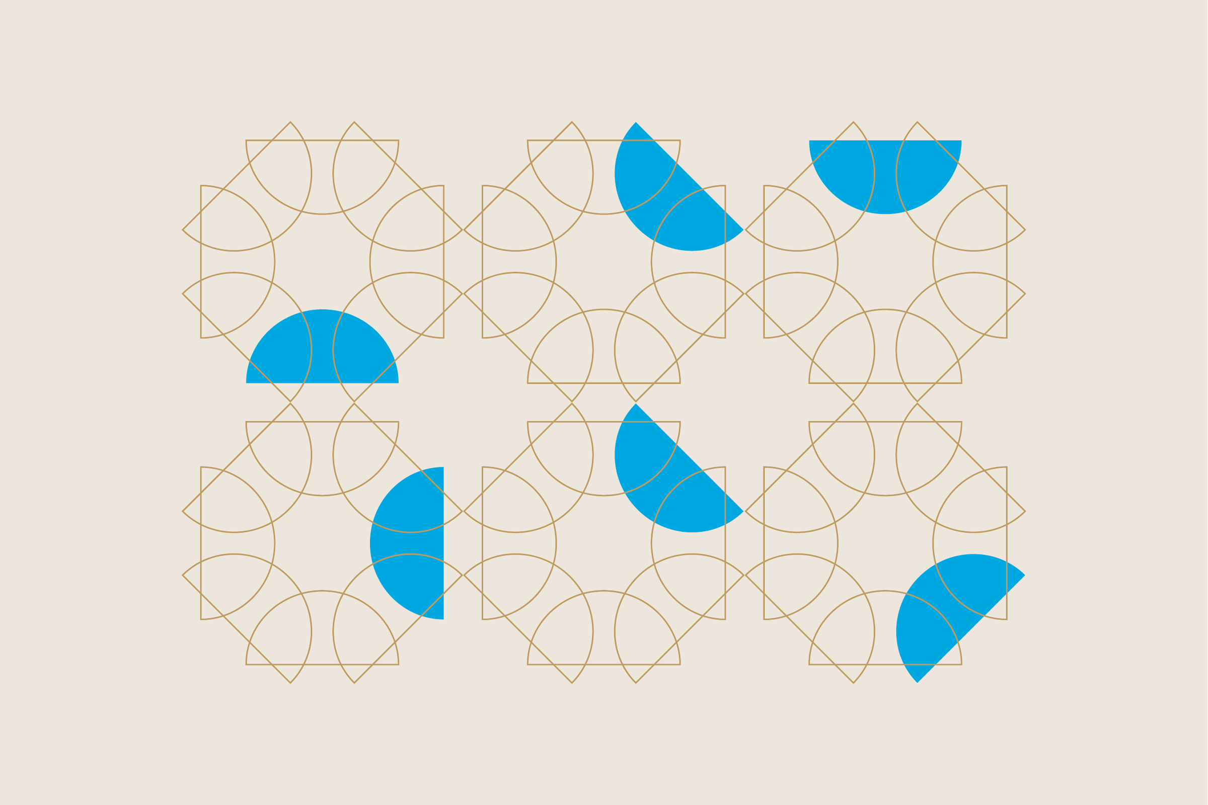
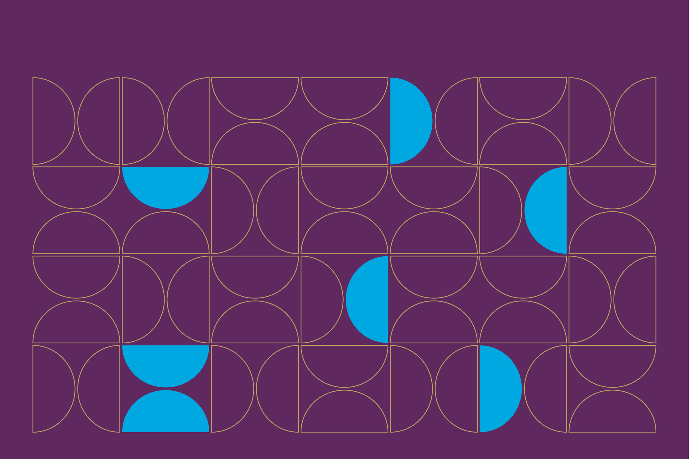
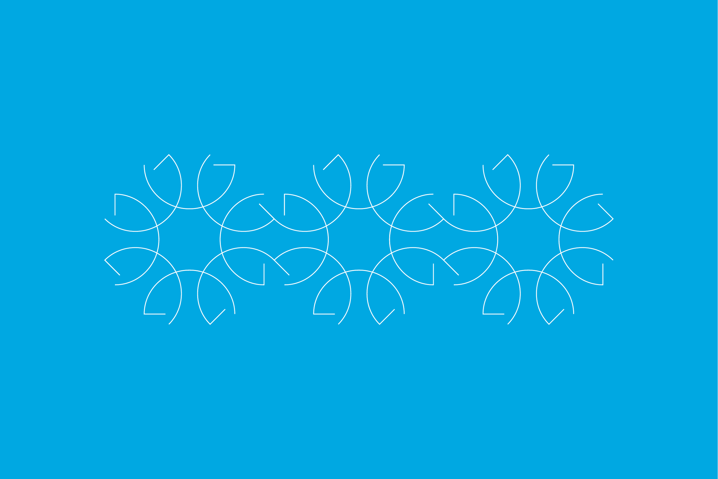
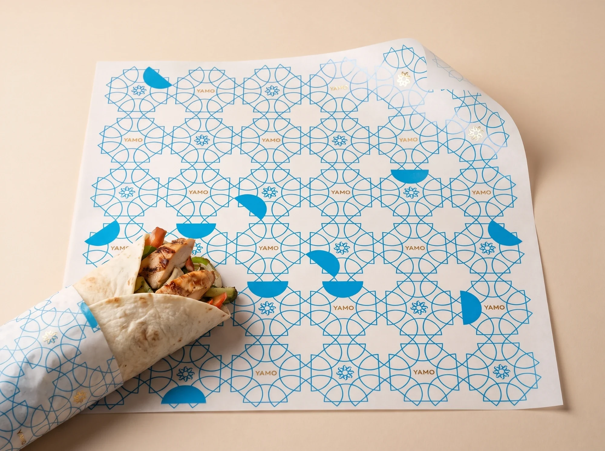
Blue (#00A8E2) leads, with cream (#EDE6DC), gold (#BE9B60) and plum (#5F295F). Three patterns follow: a lattice of arcs scattered with blue half-moons, a grid of half-circles, and the rosette’s petals in a row. Zain is the typeface, in Arabic and Latin.

Packaging
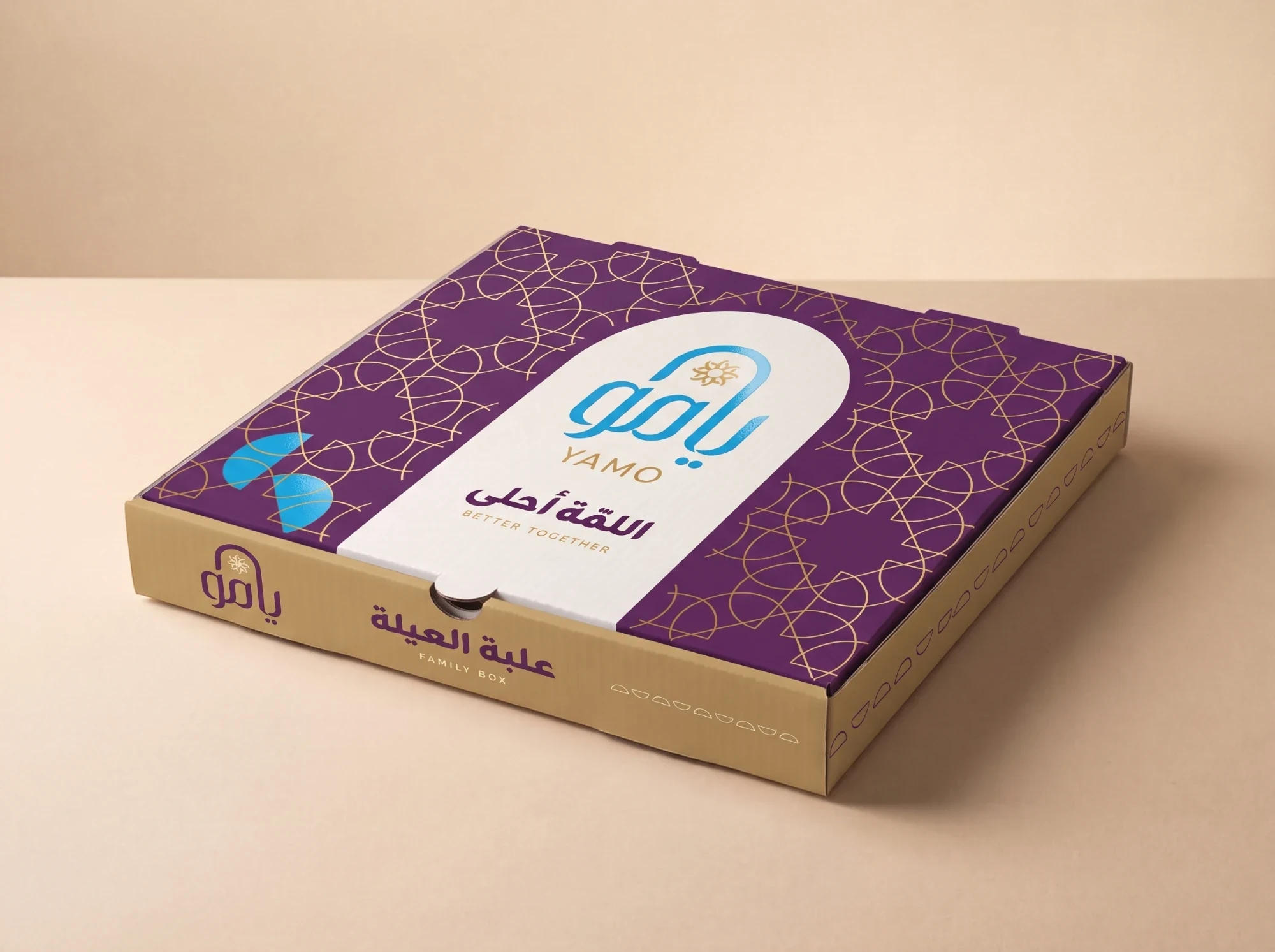
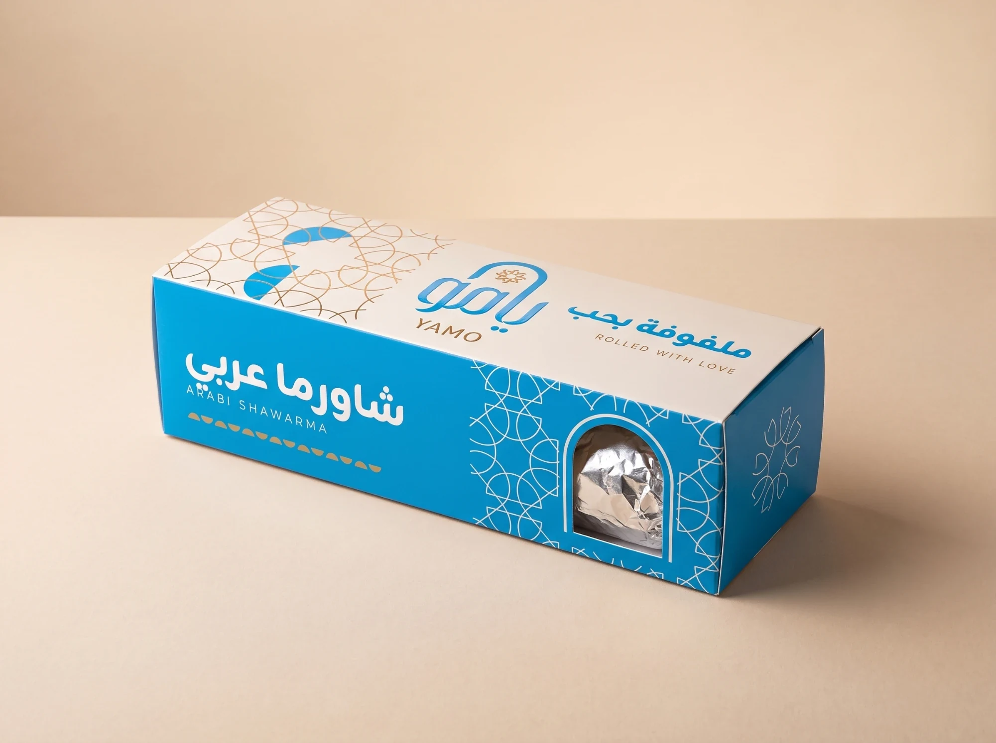
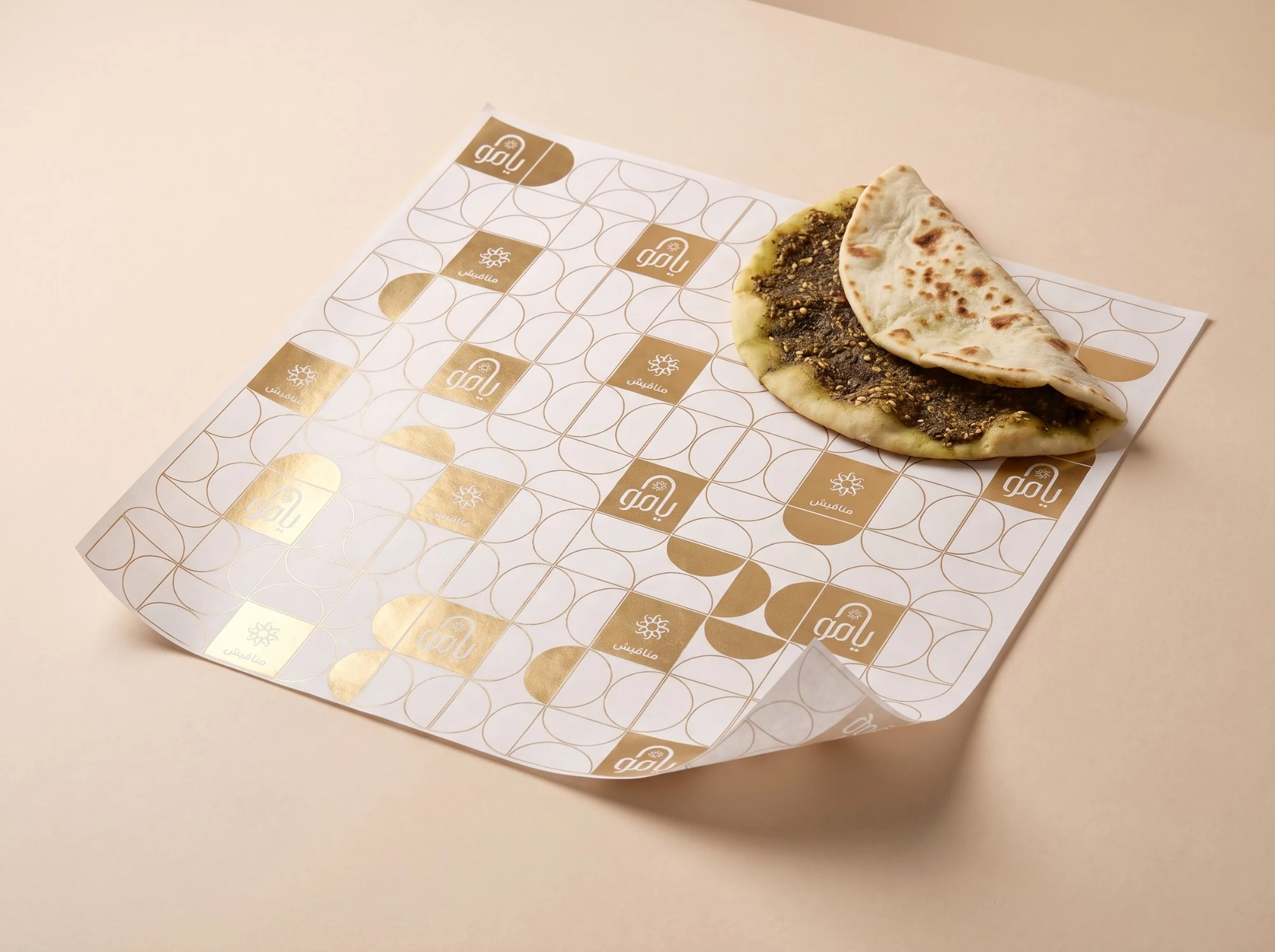
Each dish gets its own pack, named in Arabic first and English below: shawarma in a windowed box or a tear-and-eat sleeve, manakish in a gold sleeve, family orders in a box of their own, with papers printed in each pattern.


Around the meal
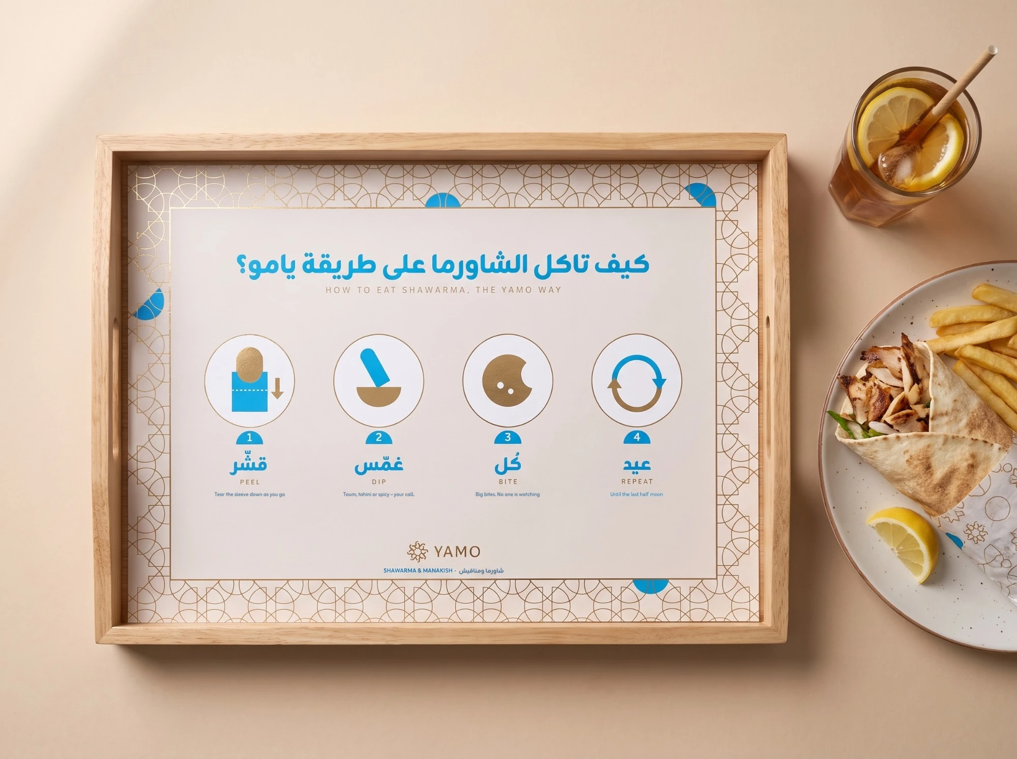
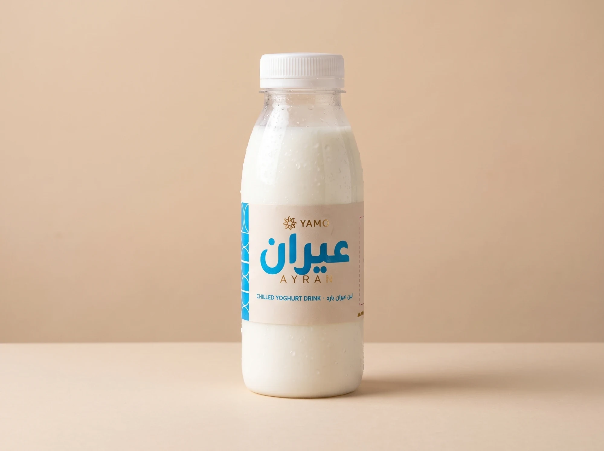
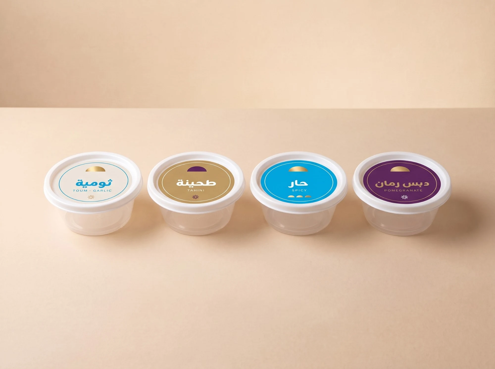
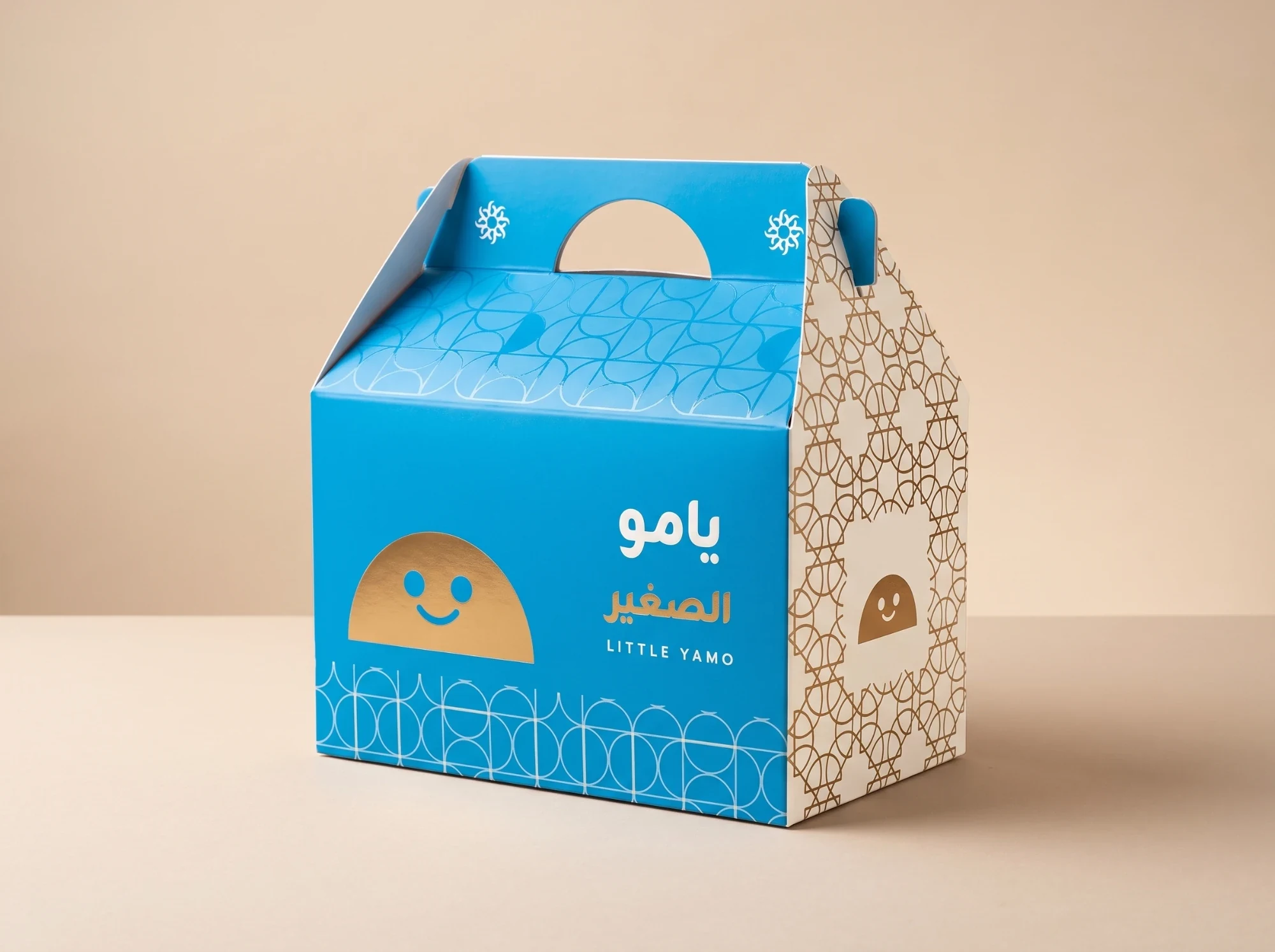
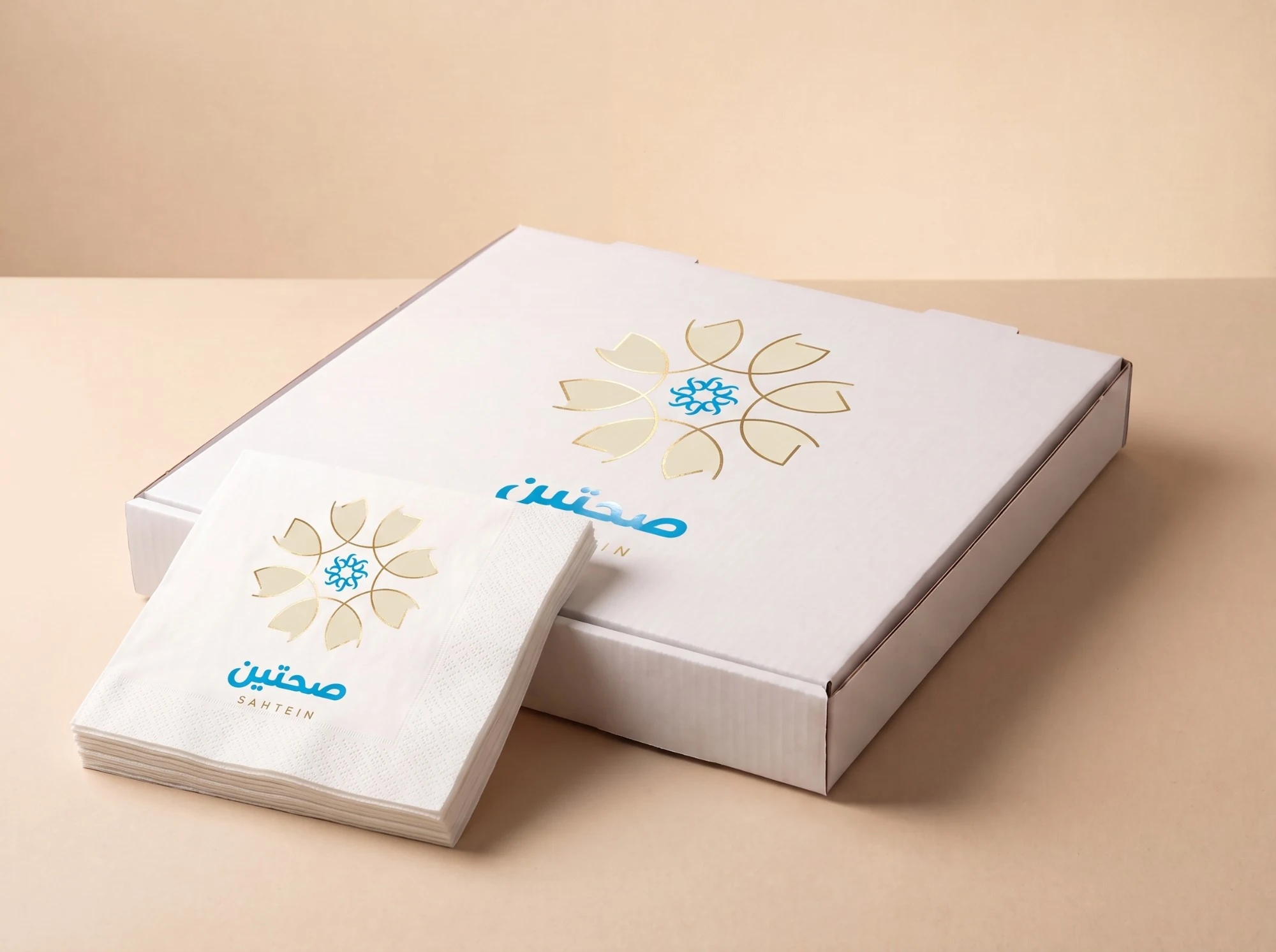
A salad bowl and fries cartons, a tray liner that shows how to eat shawarma the Yamo way, hot and cold cups, ayran, sauce pots and a dip tub, a box for children, packing tape and napkins.