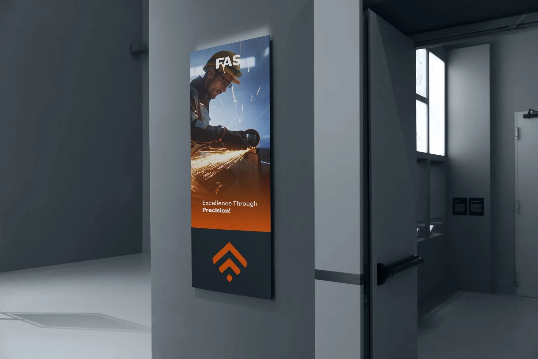
The identity for FAS carries the line “Excellence Through Precision!” It starts from three keywords: leading, precision and proficiency.
Inspiration keywords
Each keyword has its own image: a flame over an industrial stack for leading, a cut diamond for precision and a craftsman at work for proficiency.

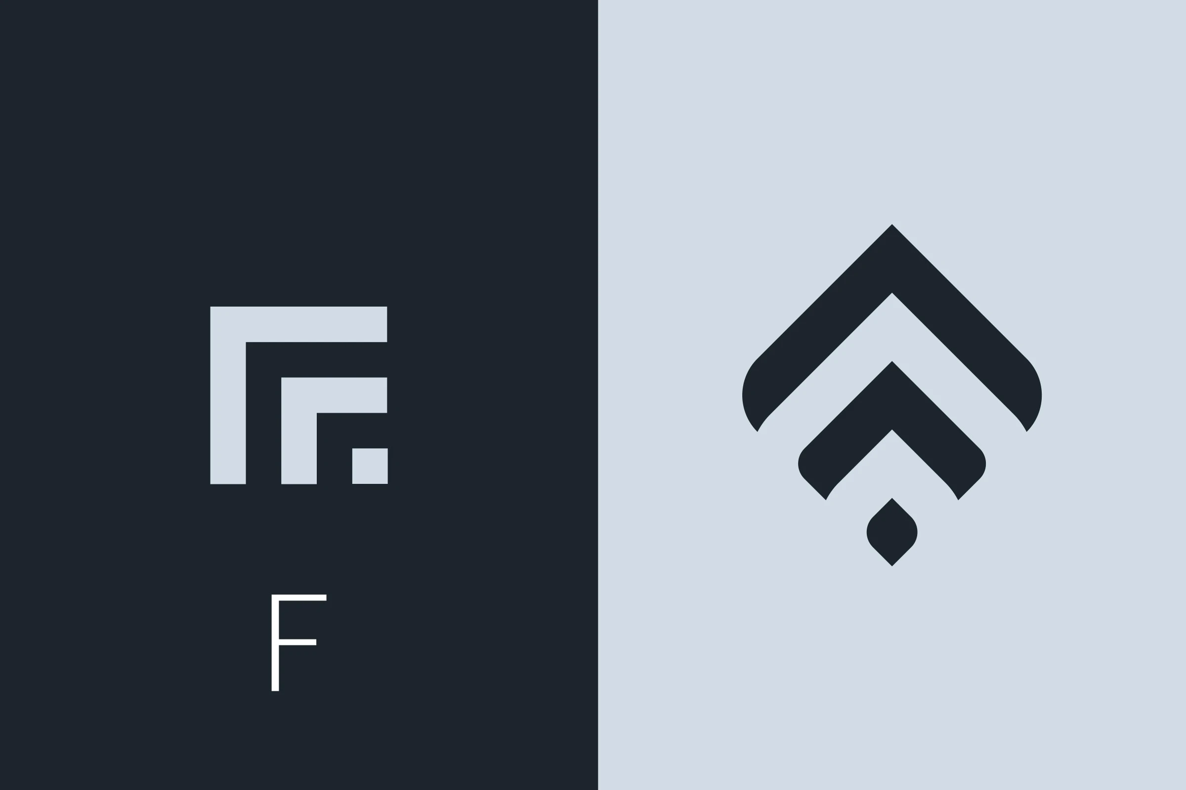
An F turned upward
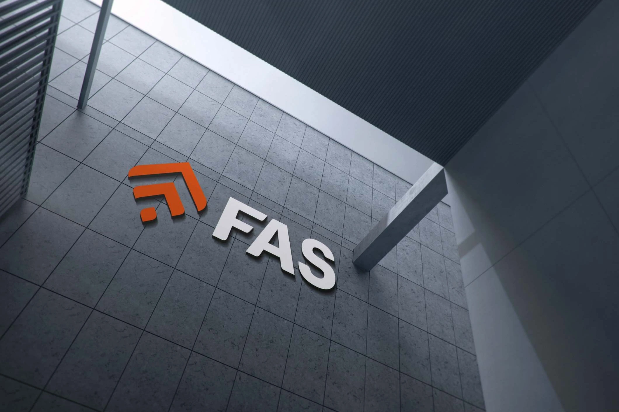
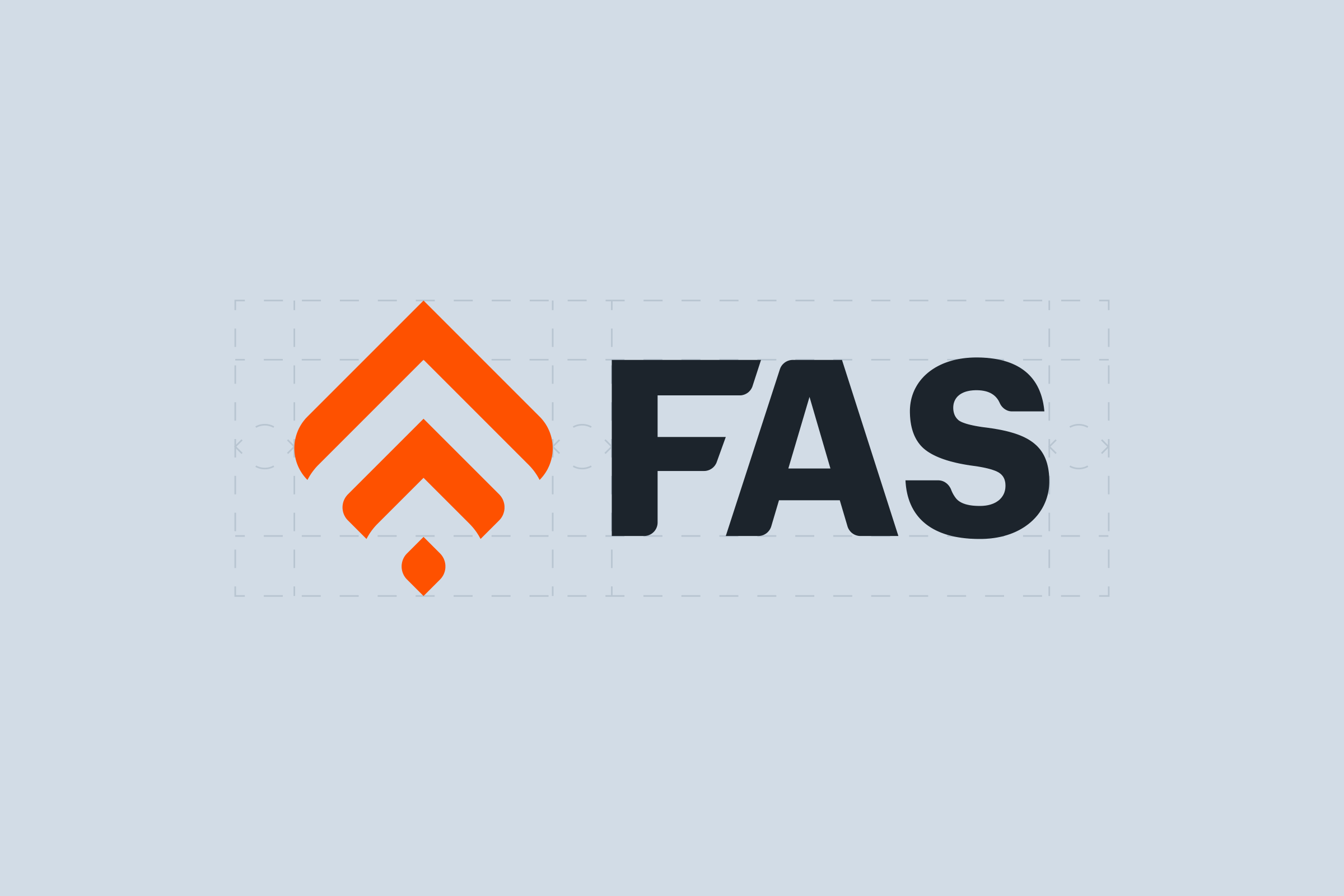
The mark is an F built from two nested corners and a square. Turned 45 degrees, the same parts point upward as two chevrons and a small diamond, with softly curved tips. Beside it, FAS is set in bold capitals.
Subsidiary logo
For the subsidiary, a derived logo turns the mark back into an F and sets it beside the word Trading.

Colour and type
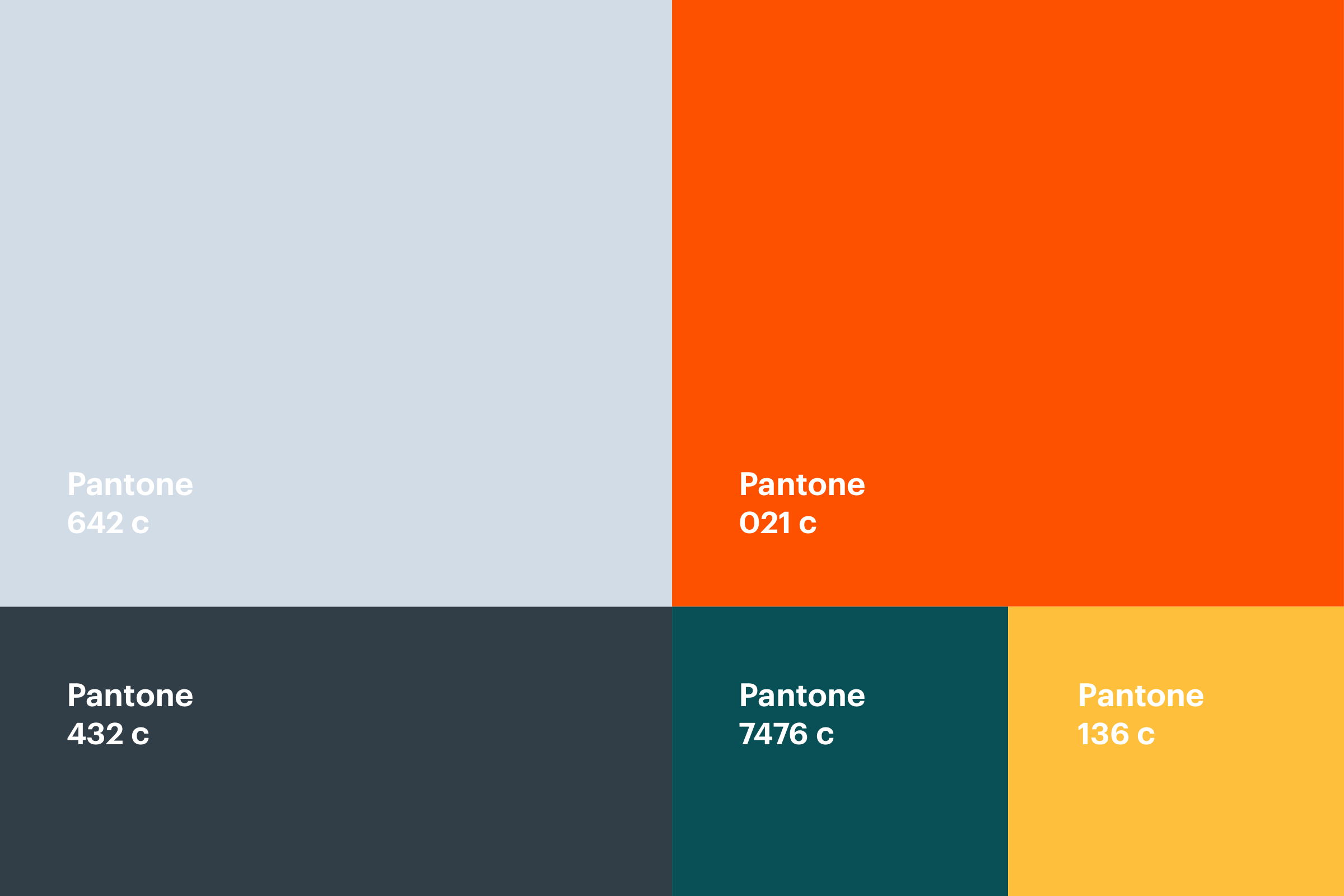
The palette sets Pantone 642 c pale blue-grey, 021 c orange and 432 c slate in large blocks, with 7476 c teal and 136 c yellow in smaller ones. Graphik Arabic is the corporate font, shown in Latin and Arabic letters.

Supportive elements
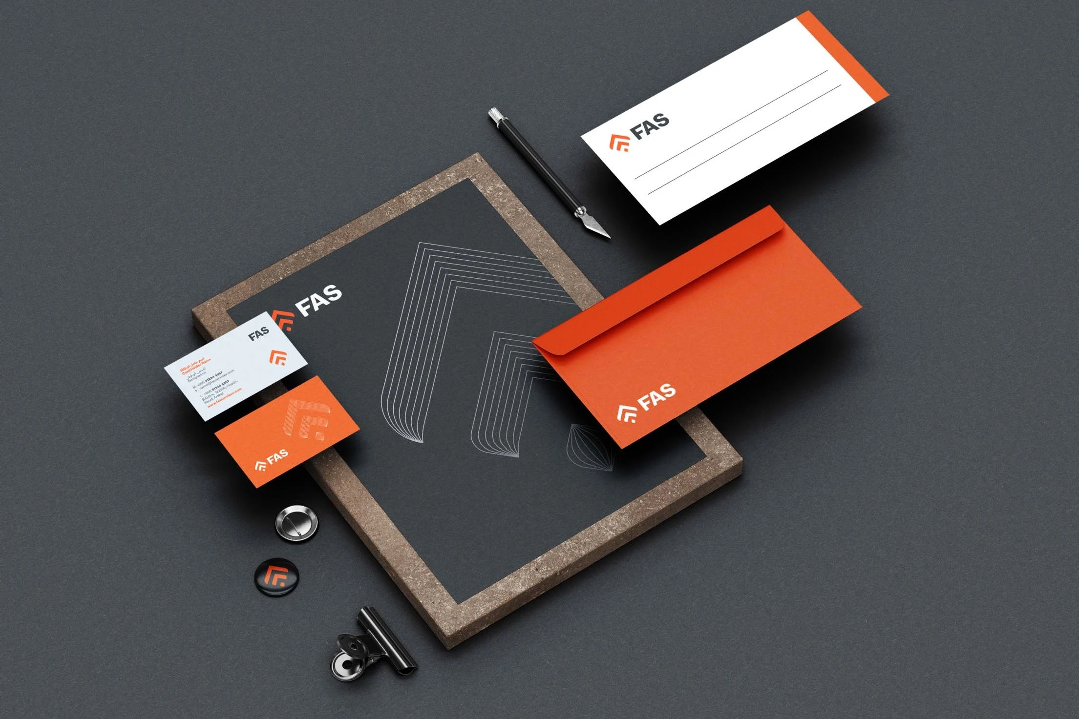
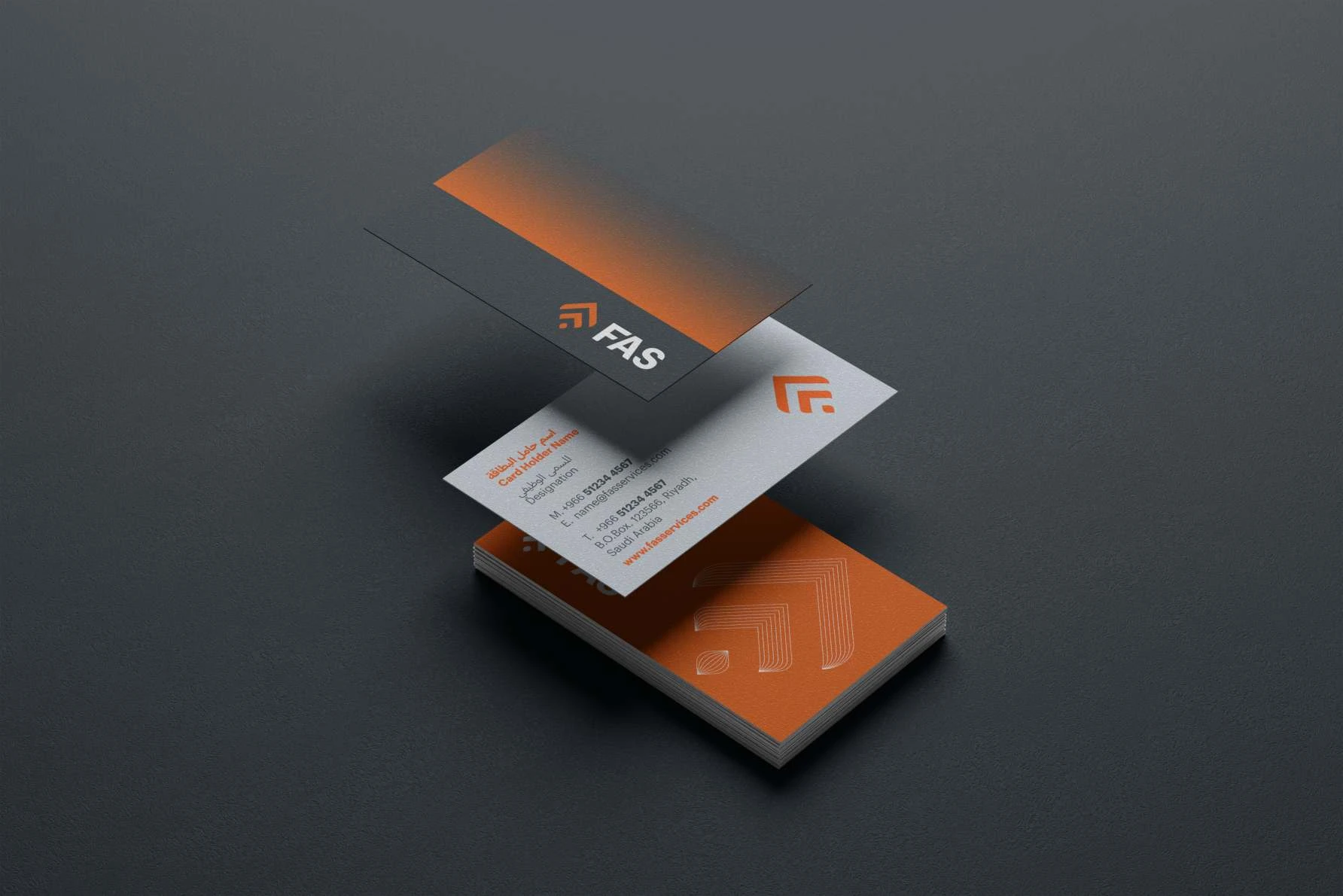
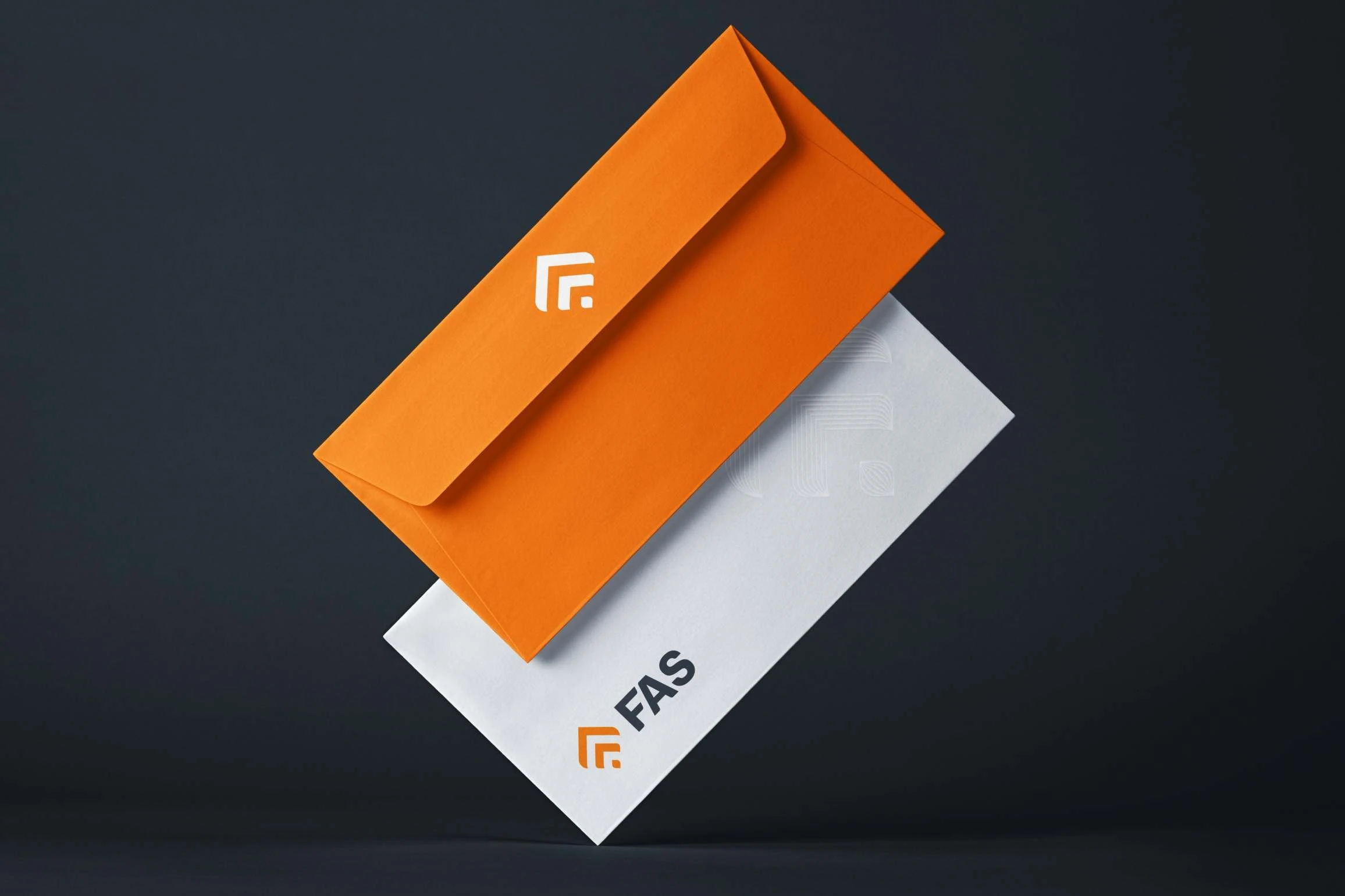
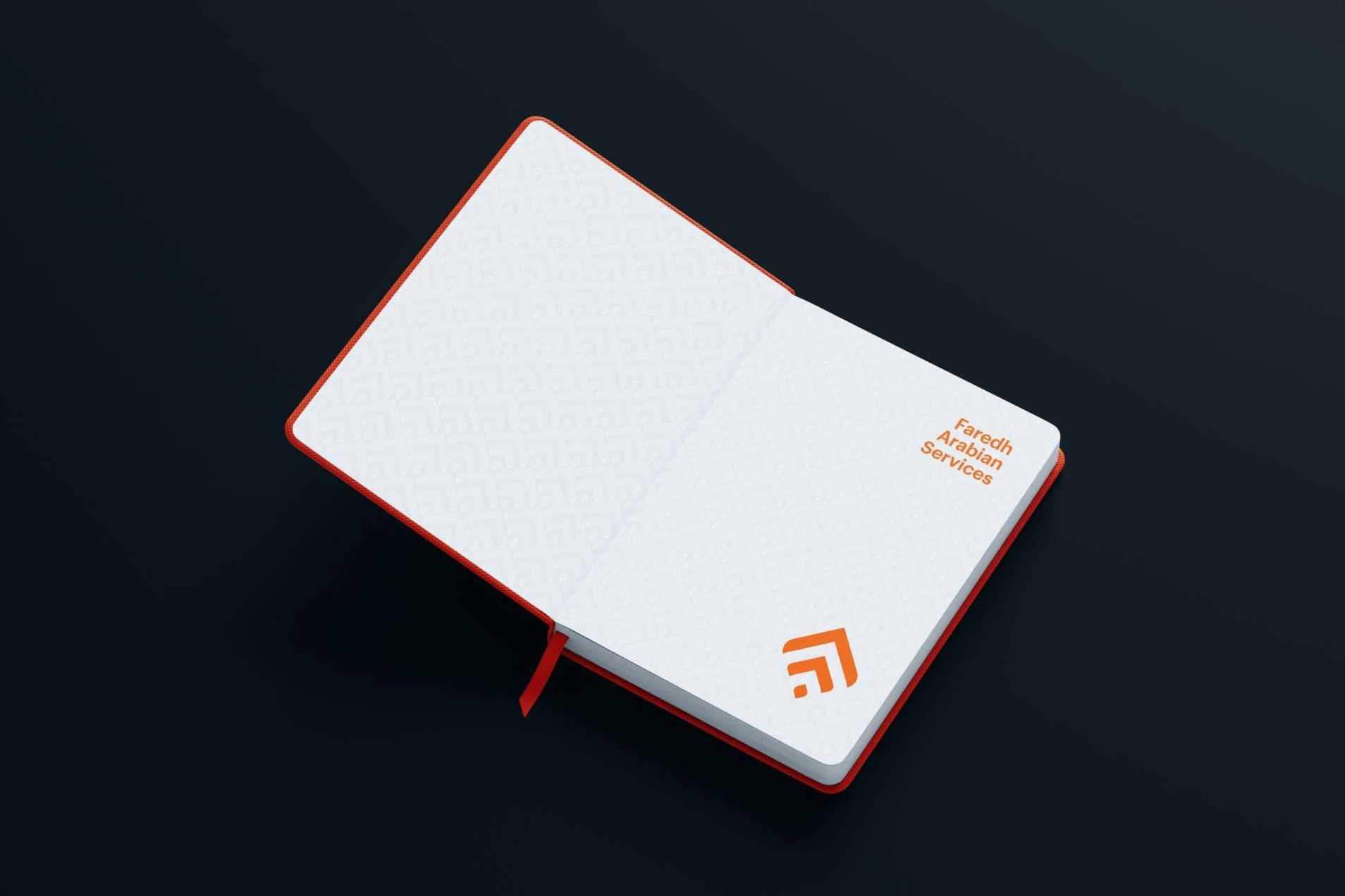
The mark is redrawn in fine parallel lines, the diamond in curved ones. Repeated and overlapped, the line marks make a pattern. The line mark returns on the stationery, printed and embossed.


Applications
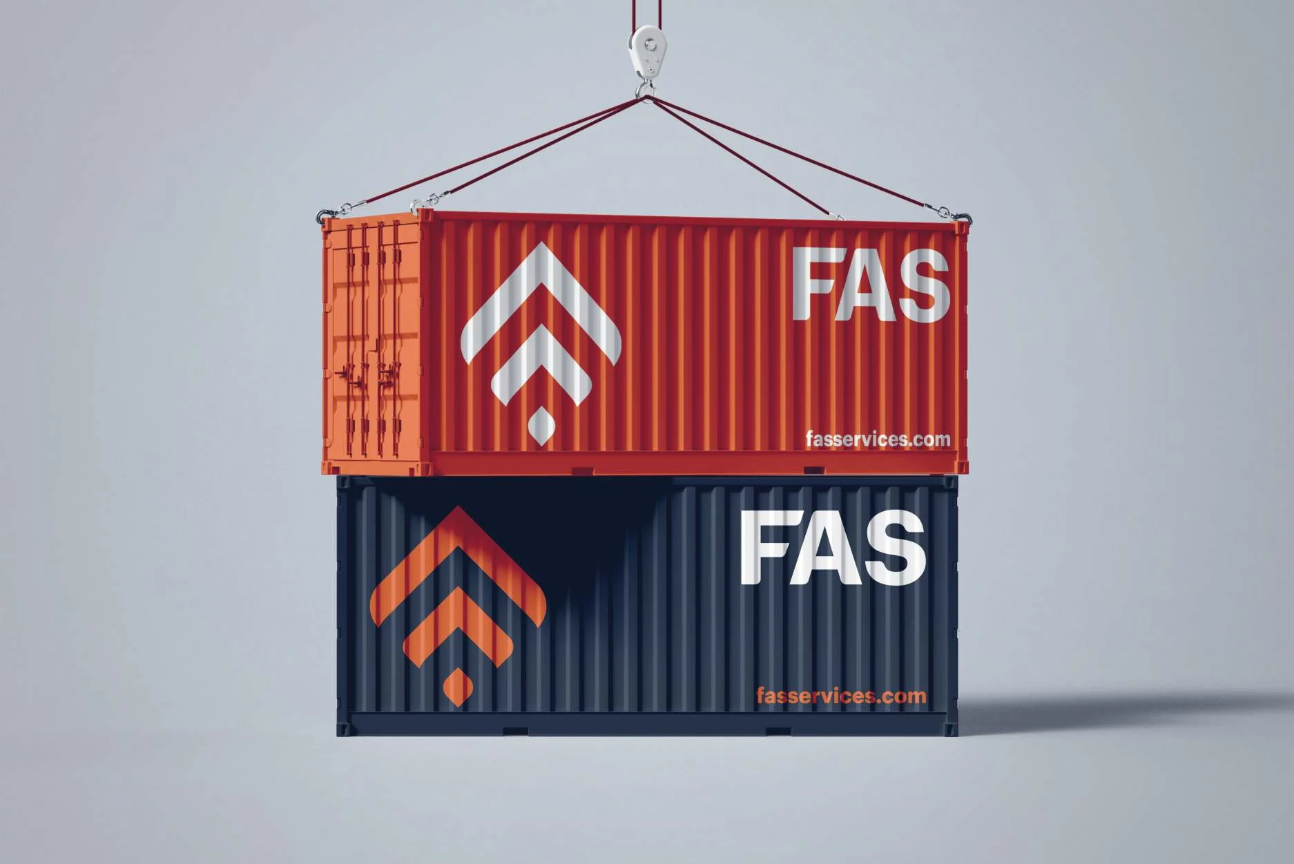
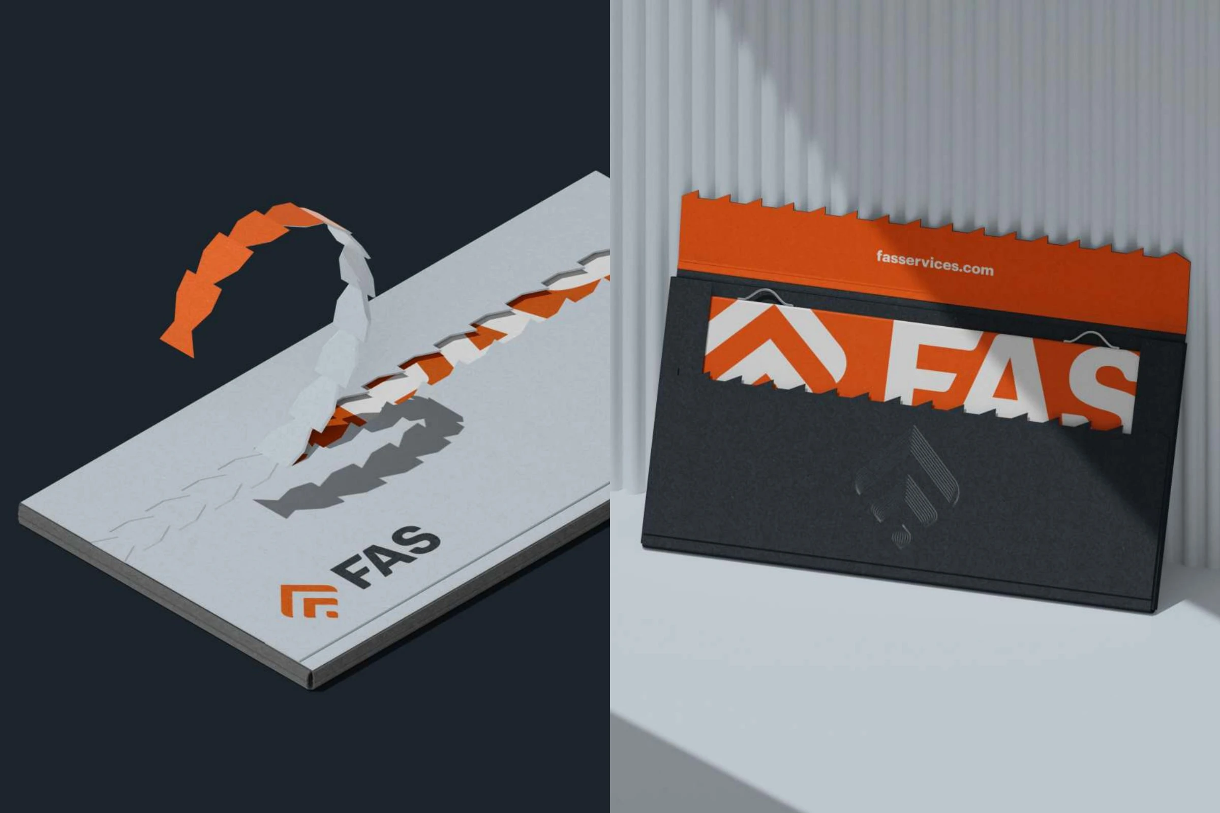
Signage for FAS and Trading, shipping containers, an indoor poster, a truck, stationery, business cards, crafted envelopes and a notebook.