Lakum Real Estate, لكم العقارية in Arabic, puts its mission in one line: “Our mission is to build relationships and foster investment opportunities to achieve sustainable growth and continuous progress.” The identity is built on the three ideas underlined in it.
Three ideas, three marks
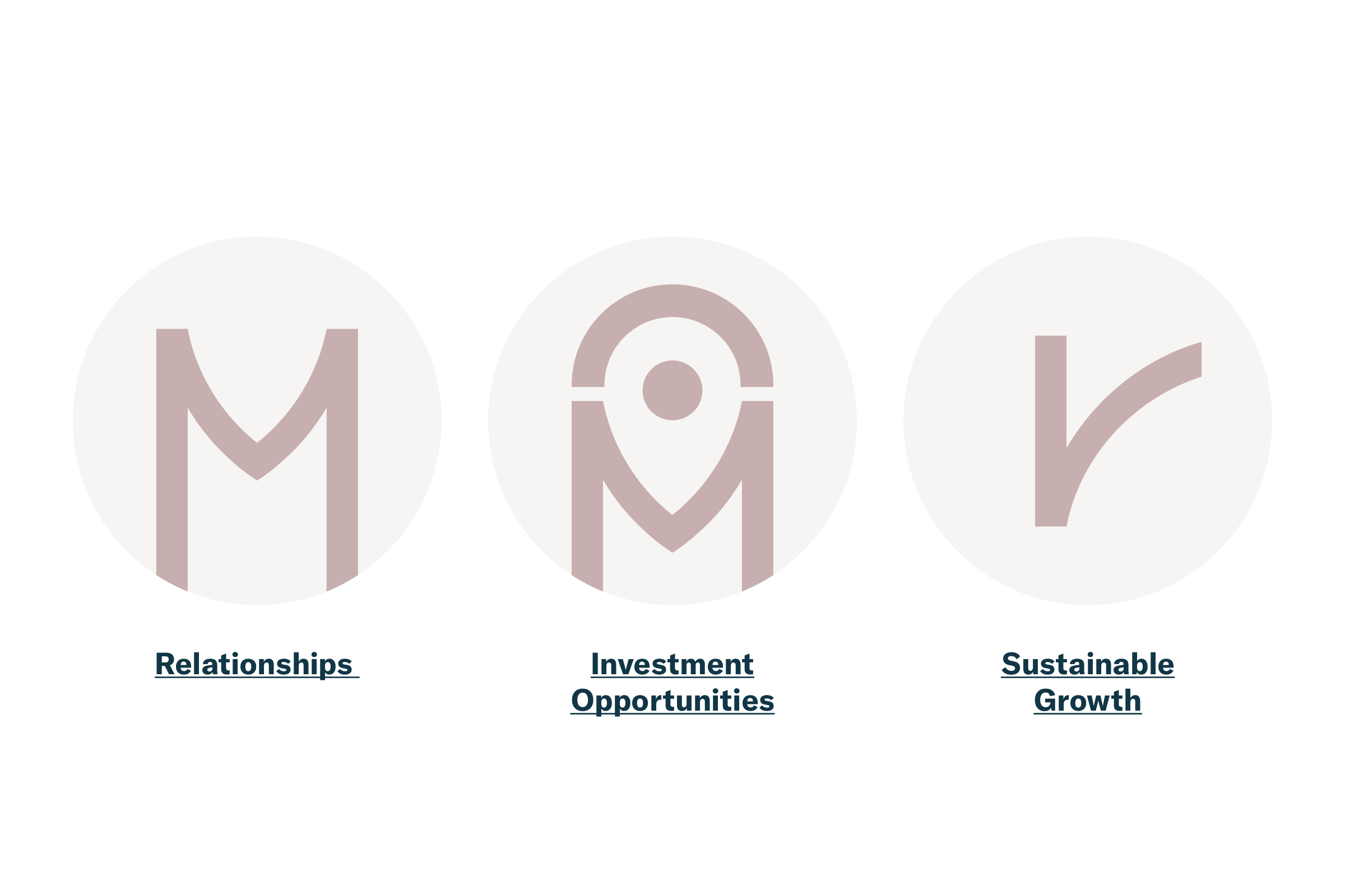
Each idea becomes a mark: an M for relationships, the same M topped by a location pin for investment opportunities, and a rising curve for sustainable growth.
Into the wordmark
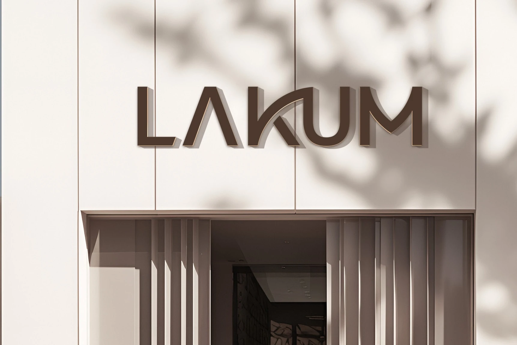
The three marks meet in LAKUM. The K’s sweeping curve is sustainable growth, the M is relationships, and a pin over the M stands for investment opportunities.

Wordmarks and emblem
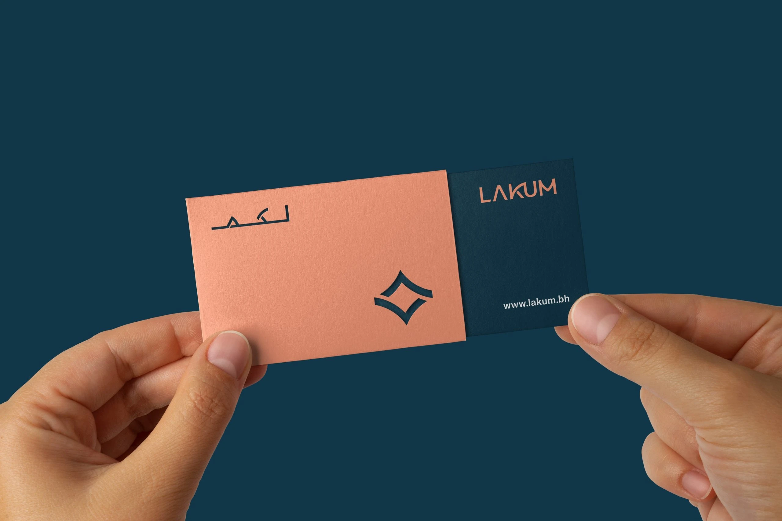
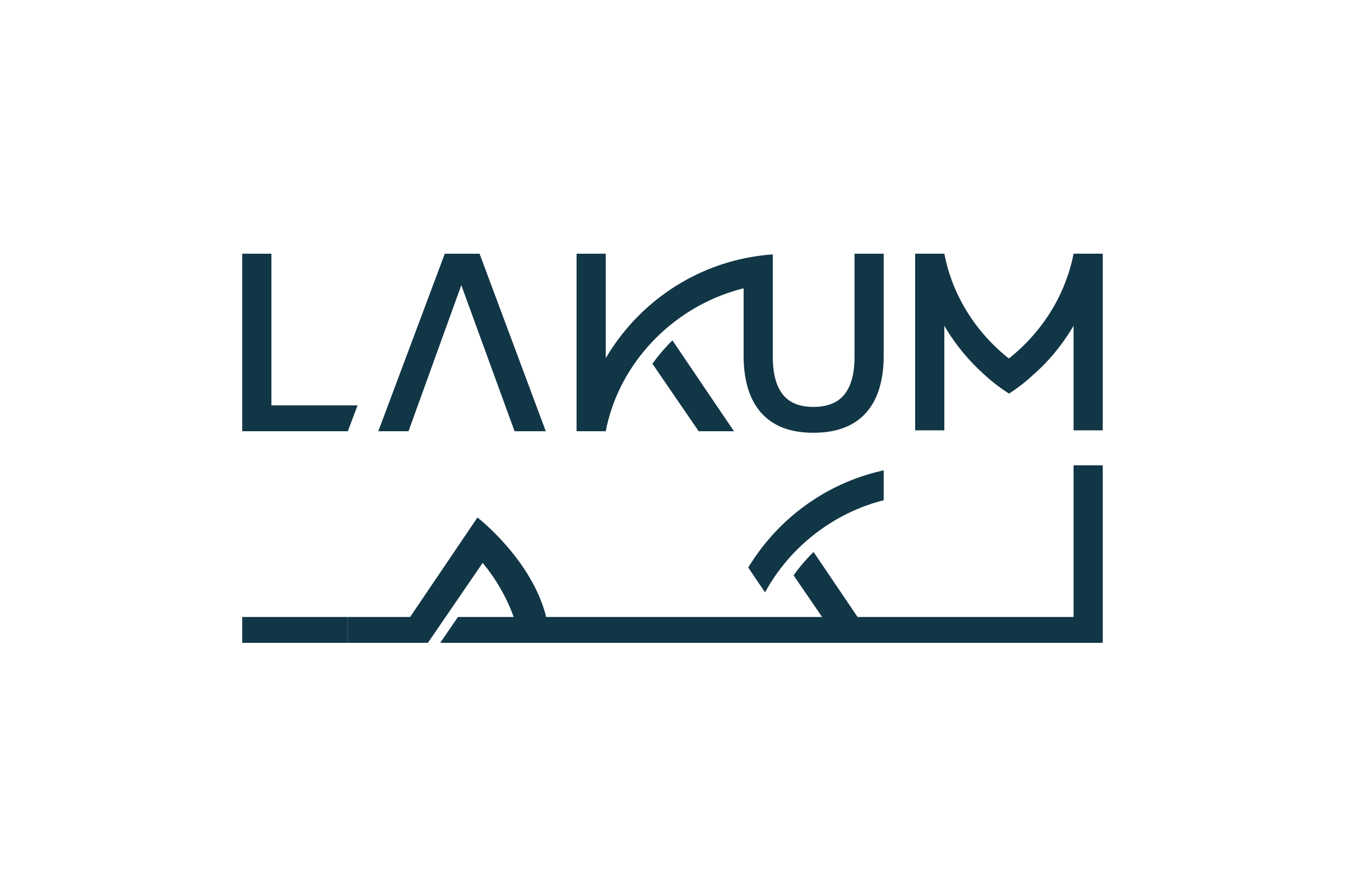
LAKUM and لكم are drawn with the same strokes and arcs. The emblem, titled Diamond from Relations (L), joins two curved strokes into a diamond. Its board adds a line: “We take pride in the close, diamond-strong bonds we share with our clients, which form the very essence of who we are.”

Logo responsiveness
The logo steps down from the bilingual lockup to a compact LKM mark, then to the emblem alone.

Colour and type
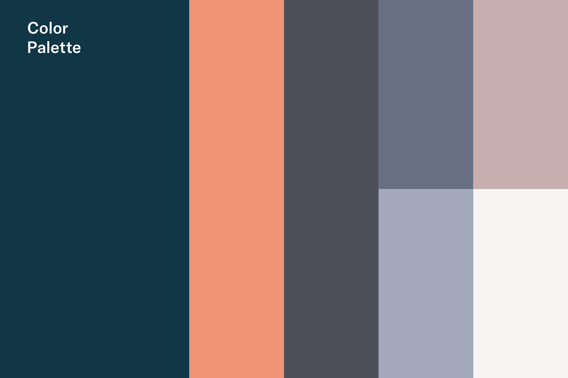
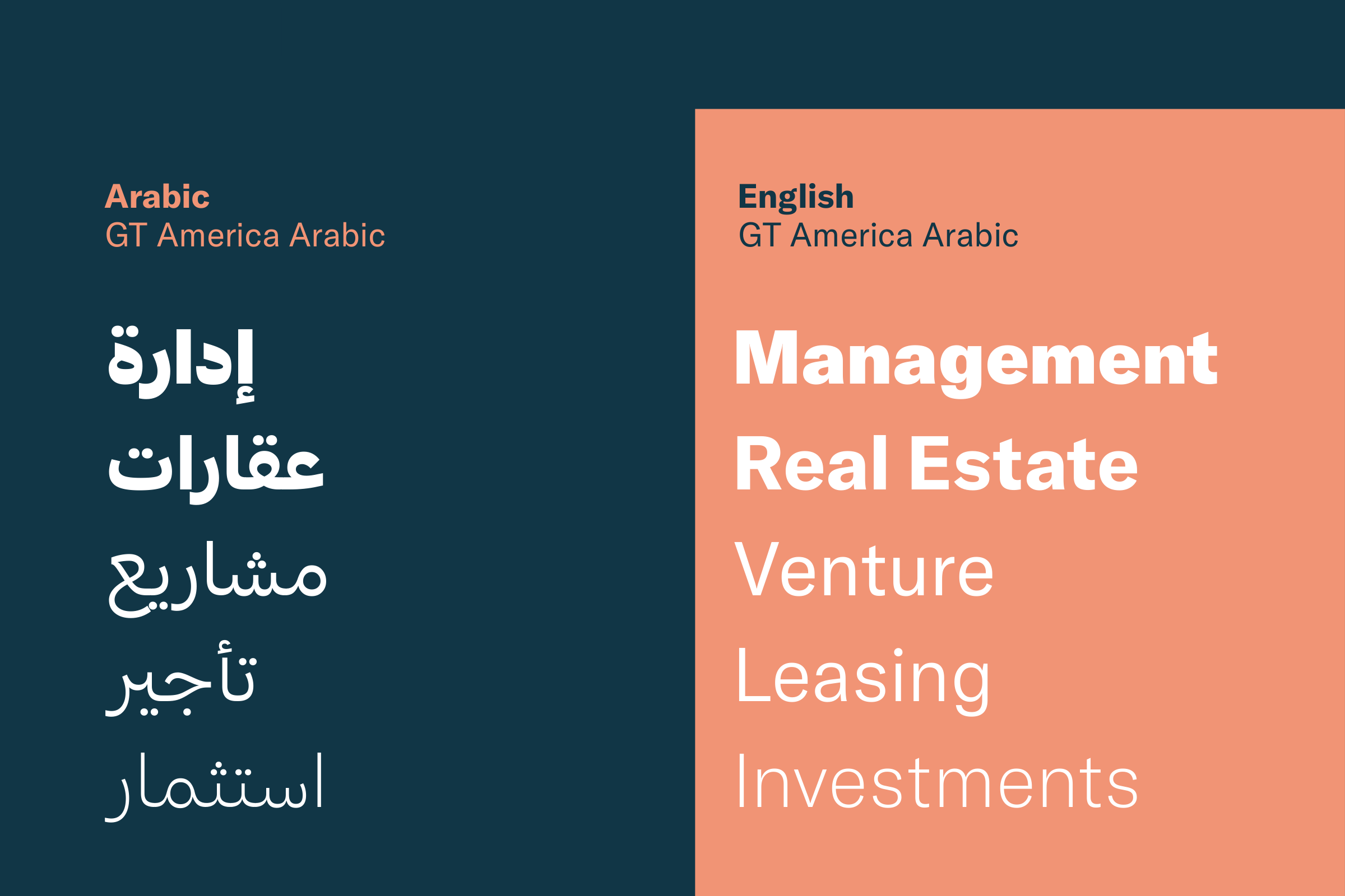
Deep blue takes the largest block, then coral and charcoal, with two greyed blues, dusty pink and off-white. GT America Arabic sets both scripts. The type board shows Management, Real Estate, Venture, Leasing and Investments, and إدارة، عقارات، مشاريع، تأجير، استثمار, from heavy to light.
Supportive element
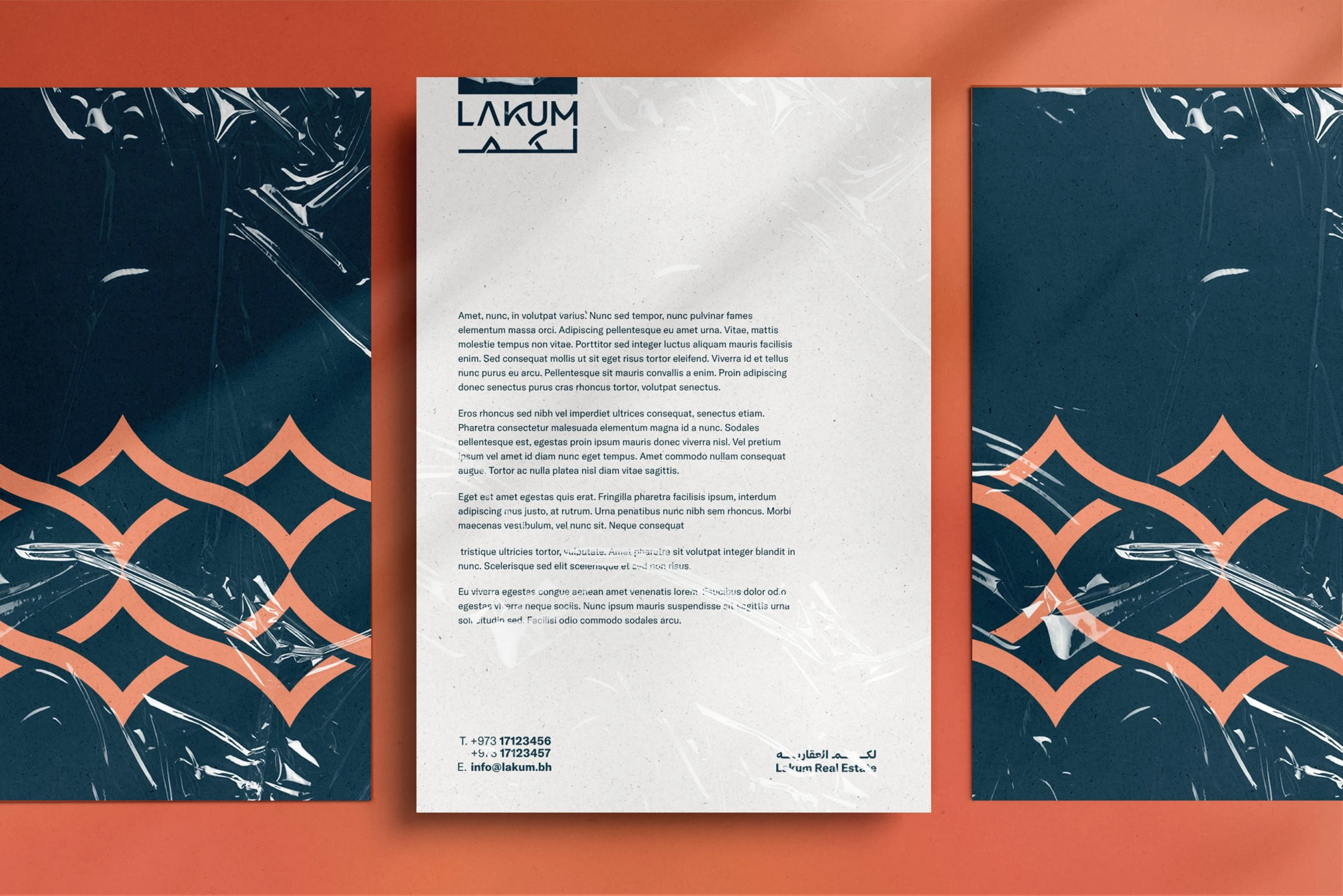
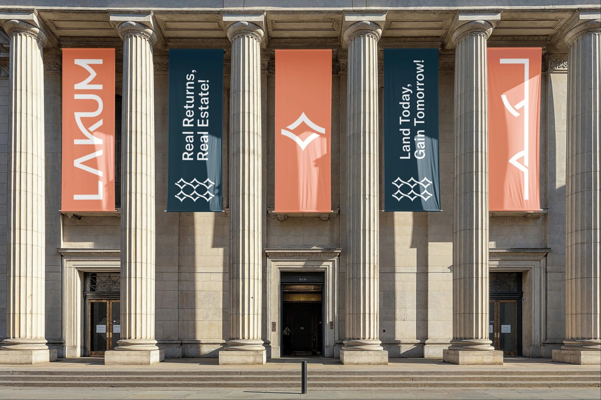
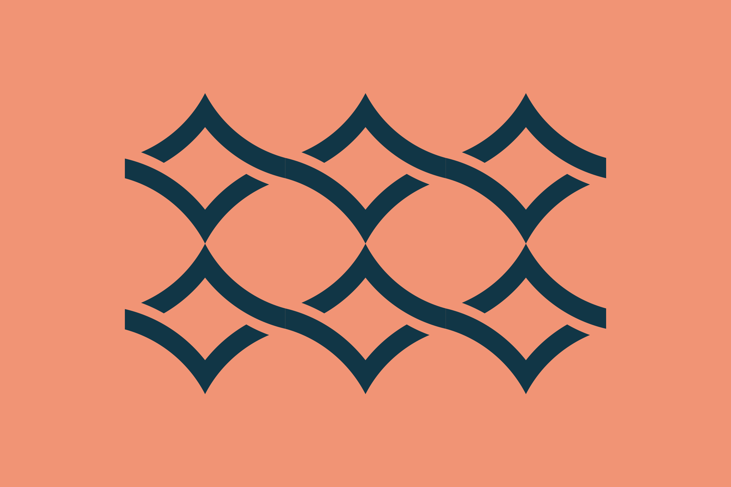
The emblem repeats and links into a lattice. It runs across the letterhead, the banners, the exhibition stand and the tote bag.
Applications
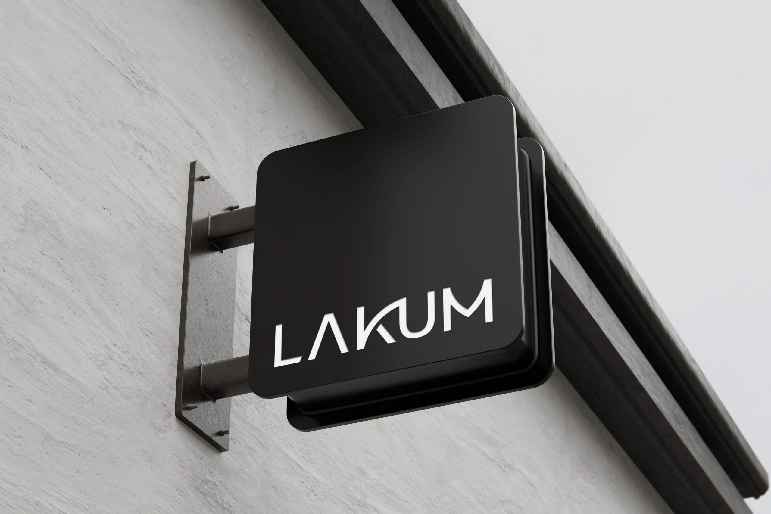
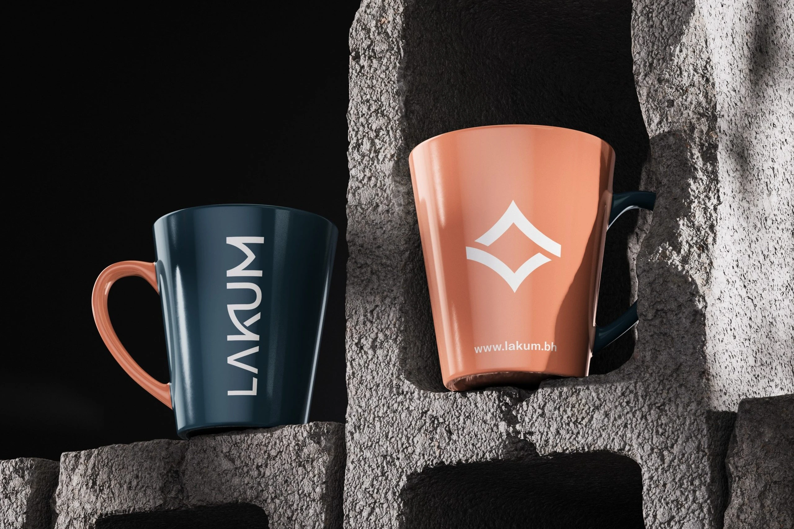
Side and front signage, a business card with the emblem cut out, letterhead, banners, an exhibition stand, a tote bag and mugs.